01
Context
Tourlane's website lets users generate a personalised trip itinerary and kick off a planning request with travel experts. Throughout that journey - from initial inquiry to booking - users have access to a portal where they can view and manage their trips, and share information with sales agents. Technically, it was meant to be a central touchpoint but in practice, it was barely used.
02
Problem
The portal had four compounding problems:
Low usage and high agent dependency.
Usability issues meant users couldn't complete basic tasks independently, so agents filled the gap. This created a direct efficiency drag on the sales team and slowed progress toward revenue goals.
Unscalable tech foundation.
The underlying tech architecture was shaky across different parts of the product and service. This made even incremental improvements restricted, slow and risky due to a lot of inter-team dependencies.
An overdue rebrand.
The rest of the product had been updated, but the portal hadn't kept pace. The result was a visibly inconsistent experience that undermined trust and made the portal feel unimportant and small.
Chronic deprioritisation.
Because the portal didn't directly contribute to conversion metrics at the time and lacked agent-efficiency features, it was perpetually bumped down the roadmap.
Why a vision?
The portal had been a low-priority topic for a long time. There was always other areas of the product that brought in immediate, visible impact that were naturally prioritised. The big question at the time was:
"Why should the business invest in this at all, now?"
So instead of proposing more quick fixes, I wanted to highlight the big picture of why we need a real central touchpoint and what this could be. A fully functioning, intuitive portal had real potential: drastically reduced agent handling time for routine tasks, a more transparent and complete user experience, and a foundation that could actually support future product goals.
I felt a vision prototype would be the right strategic tool that would help me create clarity and build the case for prioritisation.
03
Discovery
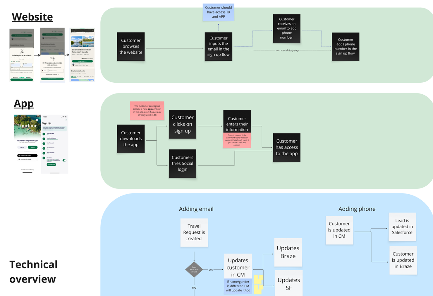
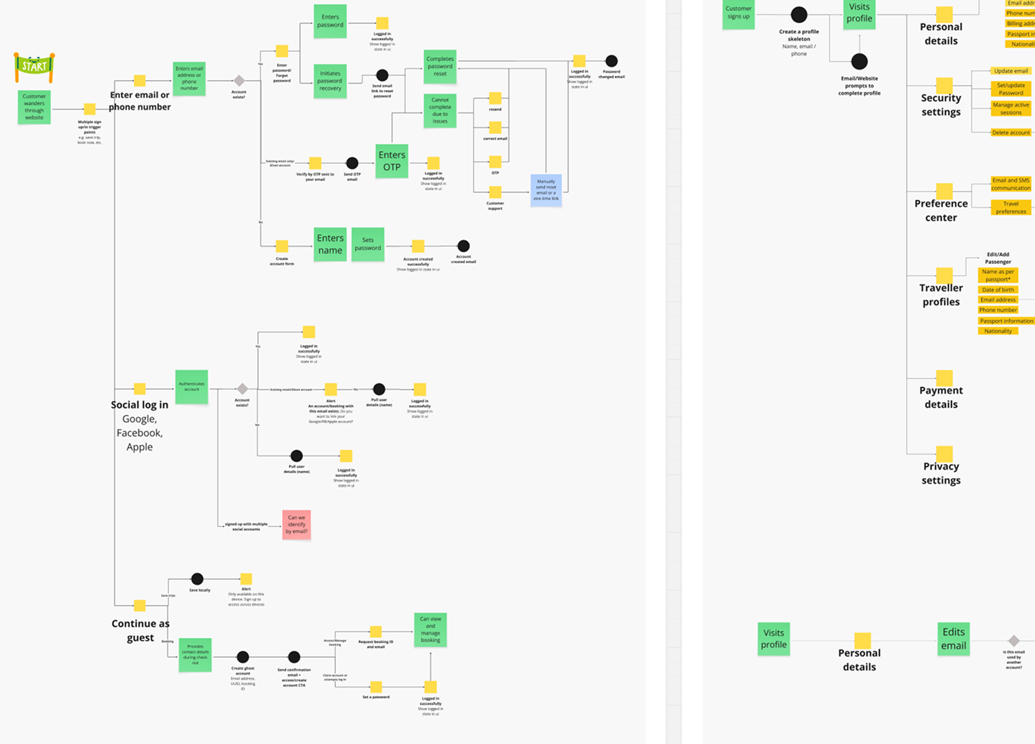
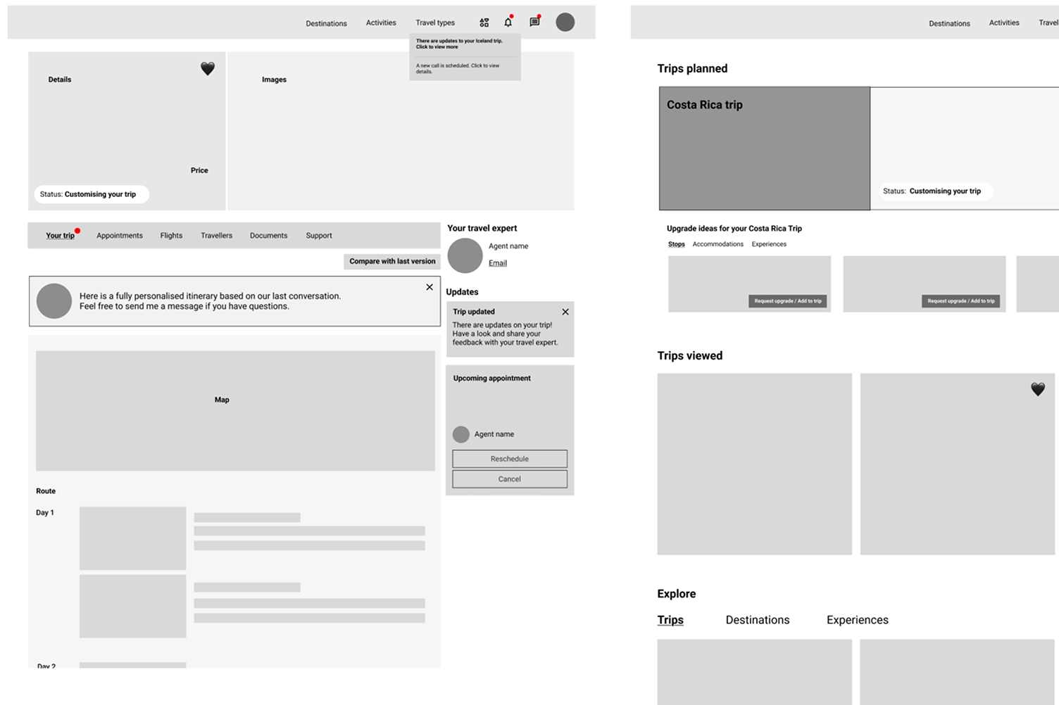
Current state mapping: With the help of my PM and engineers, I mapped the existing portal across 2 views - the user journey, and the underlying operational and system flow.
This primarily surfaced structural flows in the form of inconsistencies in the tech architecture and gaps in information flow between product areas.
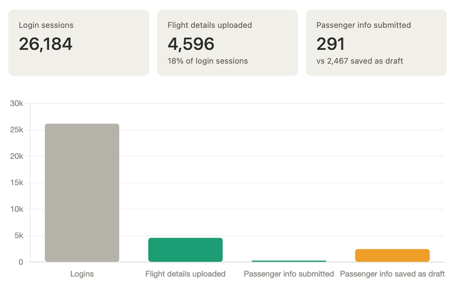
Existing data: Usage analytics confirmed low engagement, and session recordings indicated the reason being poor UX, and a general lack of information to engage with.
Agents also shared feedback that users are more comfortable relying on the agent rather than the portal, which also indicated a lack of trust in the digital system.
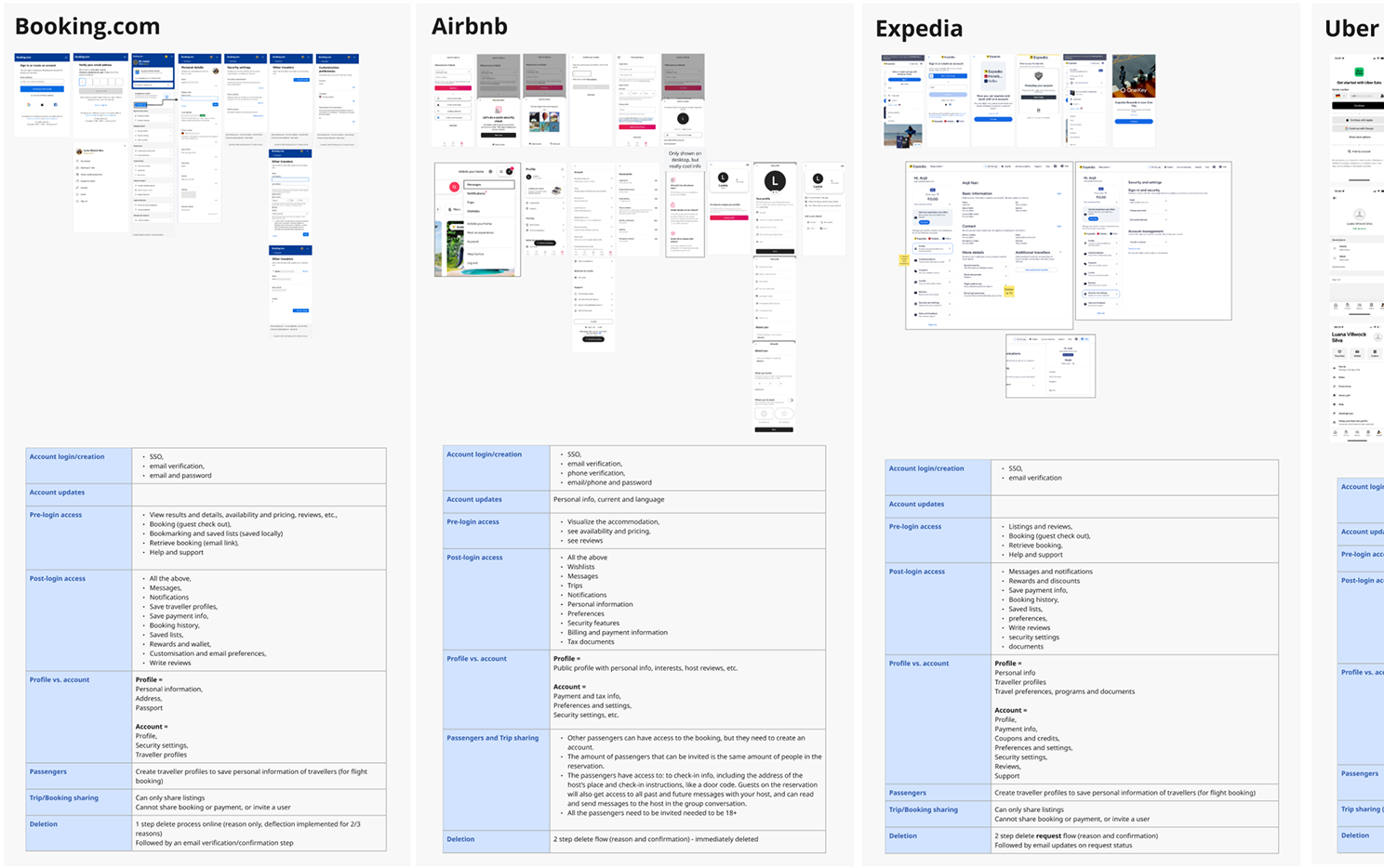
Benchmarking: I reviewed user account and portal experiences across other travel providers to understand how accounts, profiles and portals were defined, how trip management was typically structured, and where Tourlane's portal fell short by comparison.
User research
The portal had never been the subject of dedicated qualitative research. Before designing anything, I needed to understand how our target users actually thought about it, where they struggled, and what they expected a portal to be.
I conducted and synthesised 6 moderated qualitative interviews with users that matched our primary target audience.
- Understand what users expect from creating an account on a travel platform.
- Identify pain points or friction in the present account creation and portal tasks.
- Gather expectations of features/ functions they value in a travel portal.
Insights
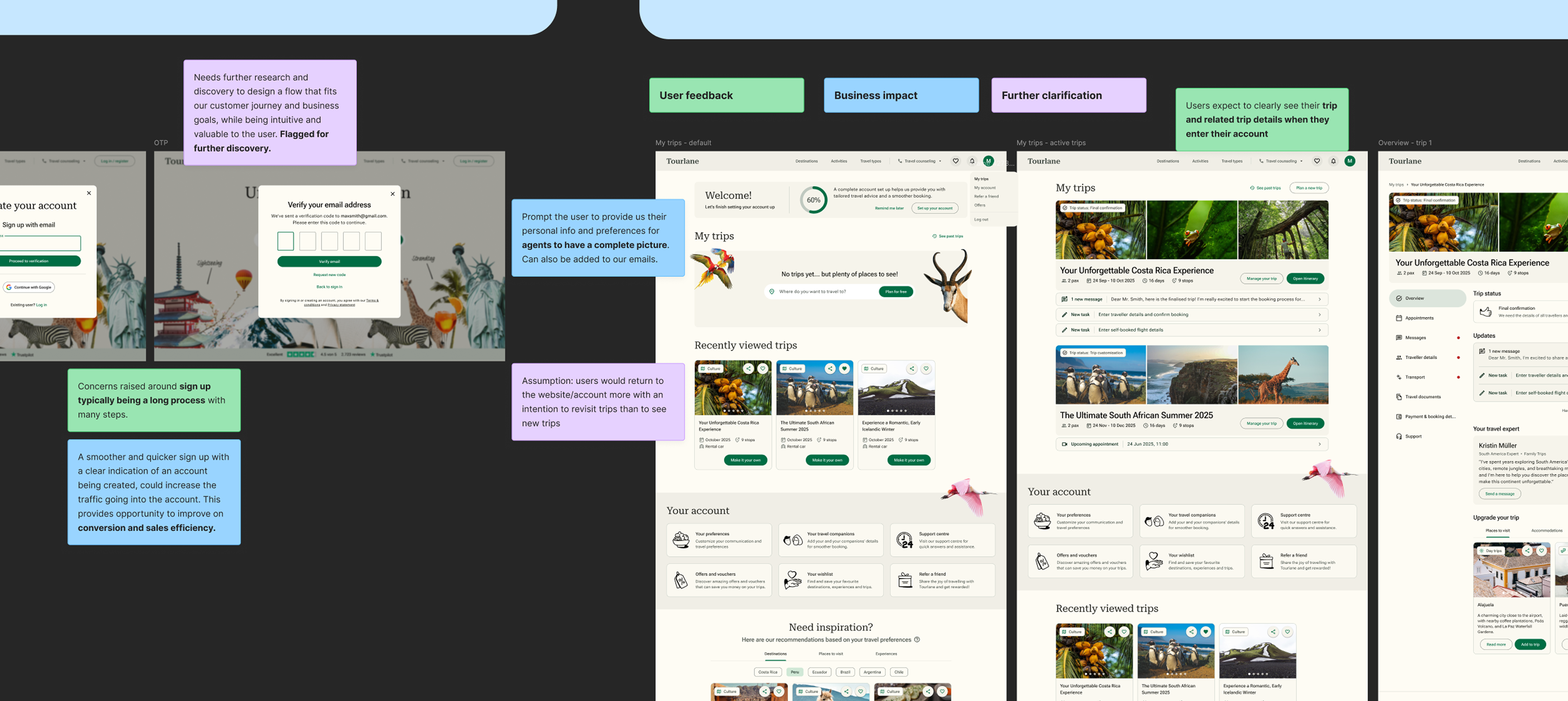
Strong mental models from other travel platforms
Most users were active users of portals on Booking.com, airline and cruise sites. Our user portal was being held to the mental model that the users had already formed elsewhere, and often failed to meet these standards both in the form of UX and feature availability.
Agent dependency was not a user preference
Users were generally comfortable self-serving (submitting traveller details, uploading documents, making simple changes) if the interface supported it. They would only rely on an agent if there's a drop in confidence or trust in the digital experience.
The trip and portal were perceived as different areas
The current experience of the trip itinerary to portal felt very separated, as two different products, that caused confusion in the users. They expect their portal to highlight and display their itinerary, as that is the key factor of their entire trip planning and booking journey.
04
Vision
The vision centred on a single idea: A unified and connected hub experience where travellers could find everything related to the trip, and stay connected with their agent.
All this without friction, without gaps, without needing to piece together information from emails and separate pages.
This also meant designing features that had long been discussed but never prioritised, to show stakeholders not just what the portal would fix, but the potential it could unlock.
Process
Flows: to get a broad idea of key interaction points and where new features could be placed.
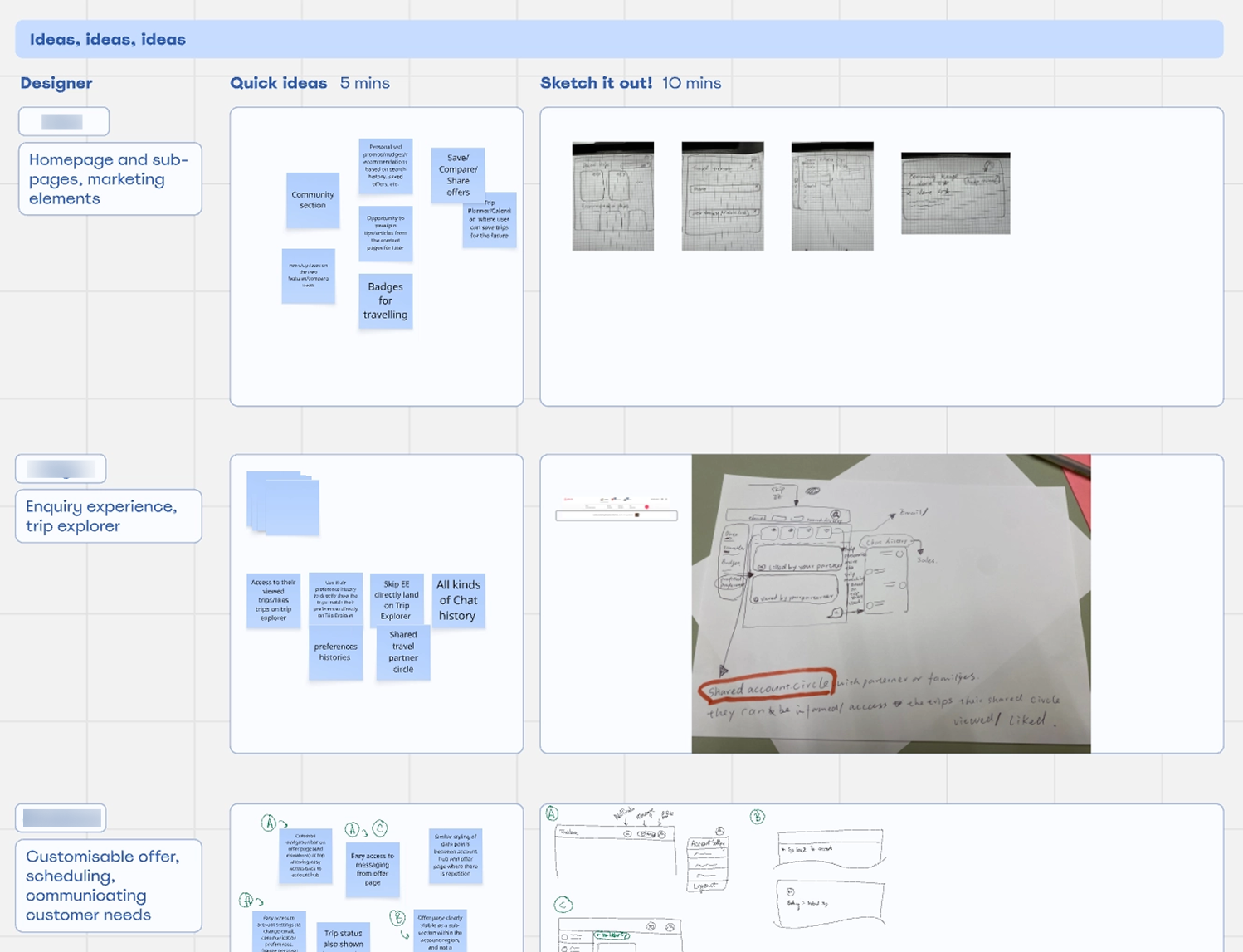
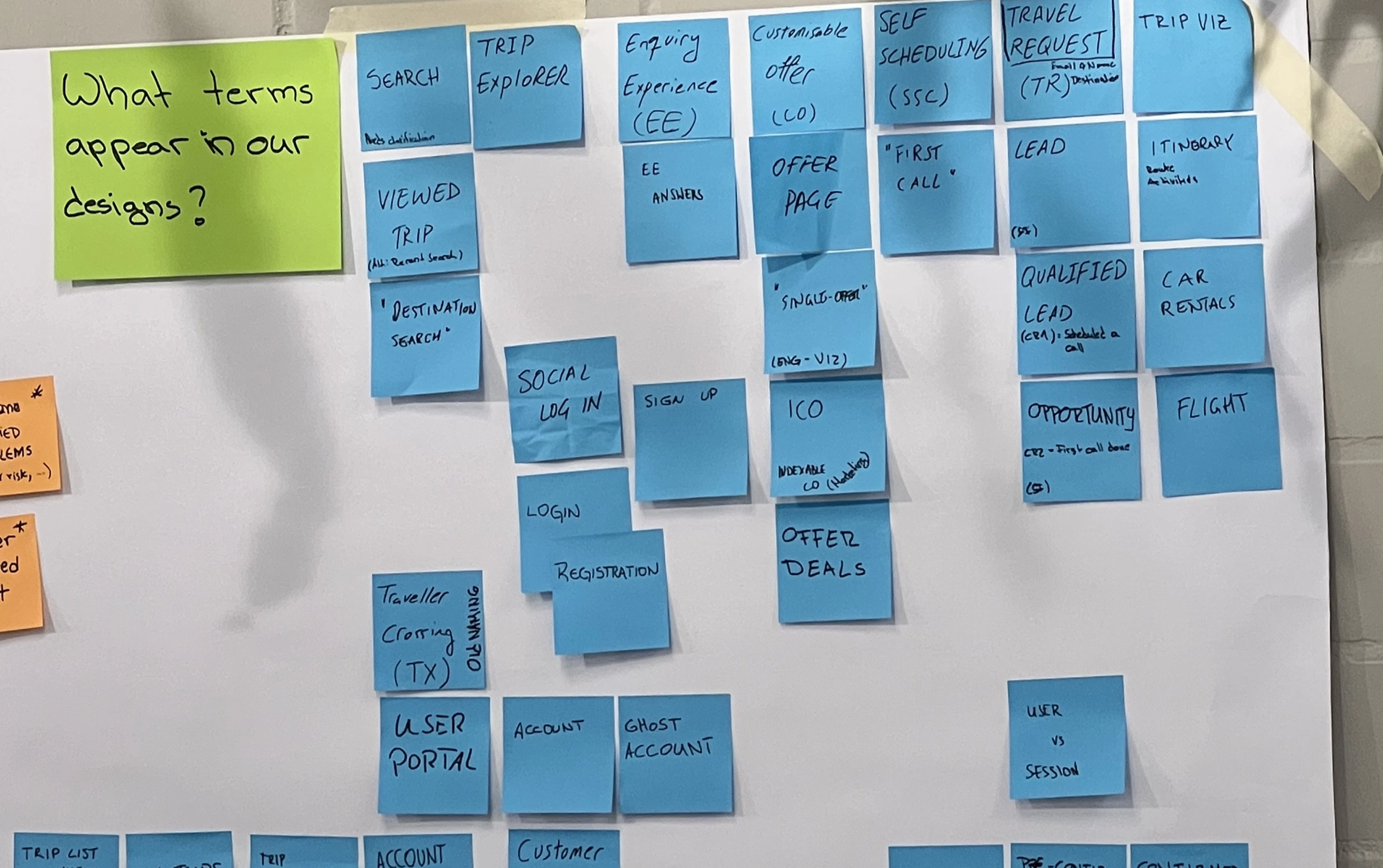
Sketches: to get my ideas out. I also invited the design team to a sketch workshop to explore different perspectives.
AI prototyping: Experimented on V0 to accelerate the process of initial alignment. The output required too much rework to justify the approach in the allotted time, so I moved to manual wireframing.
Wireframes and alignments: Conversations with other teams and departments (CRM, Sales) were essential since changes to the portal either directly affected their interfaces or changed how information flowed between systems.
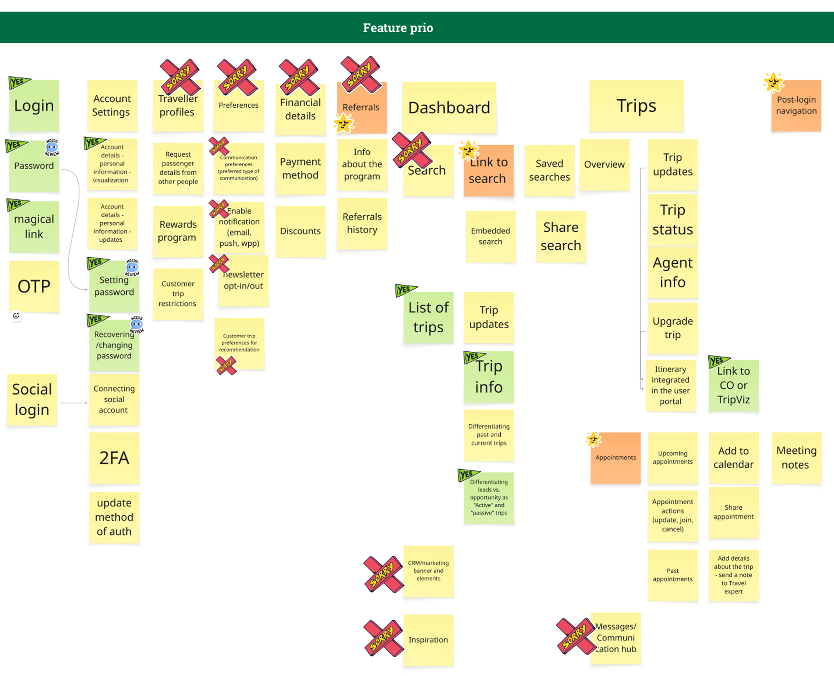
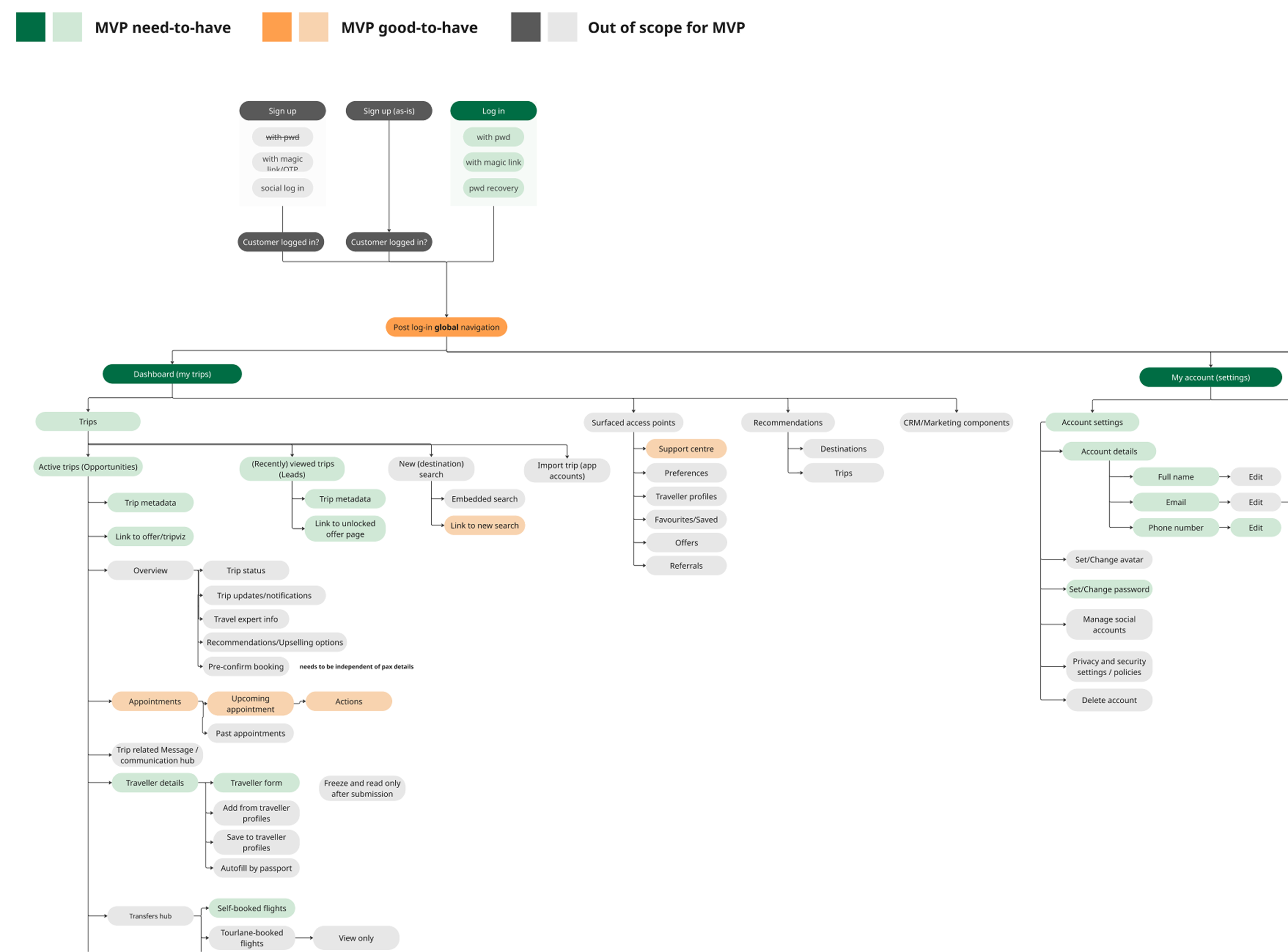
Scoping the vision: Through cross-functional discussions, the PM and I made a deliberate call to scope the vision to what was feasibly buildable within roughly a year.
The most significant decision was keeping the trip itinerary linked separately rather than fully embedded within the portal. The itinerary being its own complex product area with active experiments and scaling plans of its own, would have created dependencies that risked both workstreams.
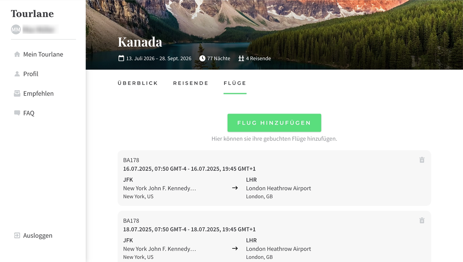
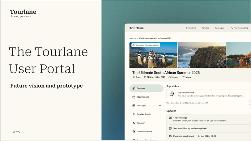
Vision prototype
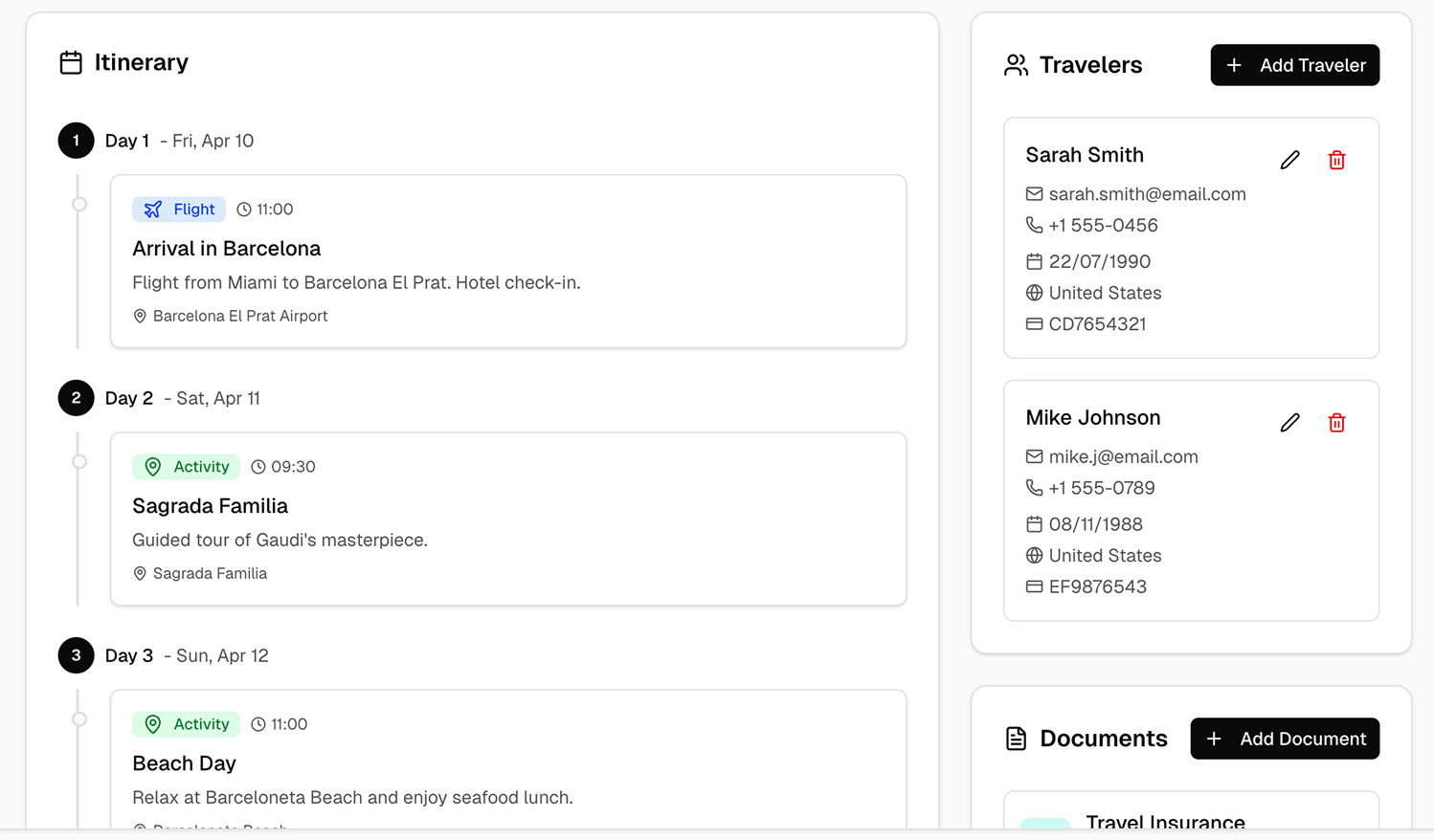
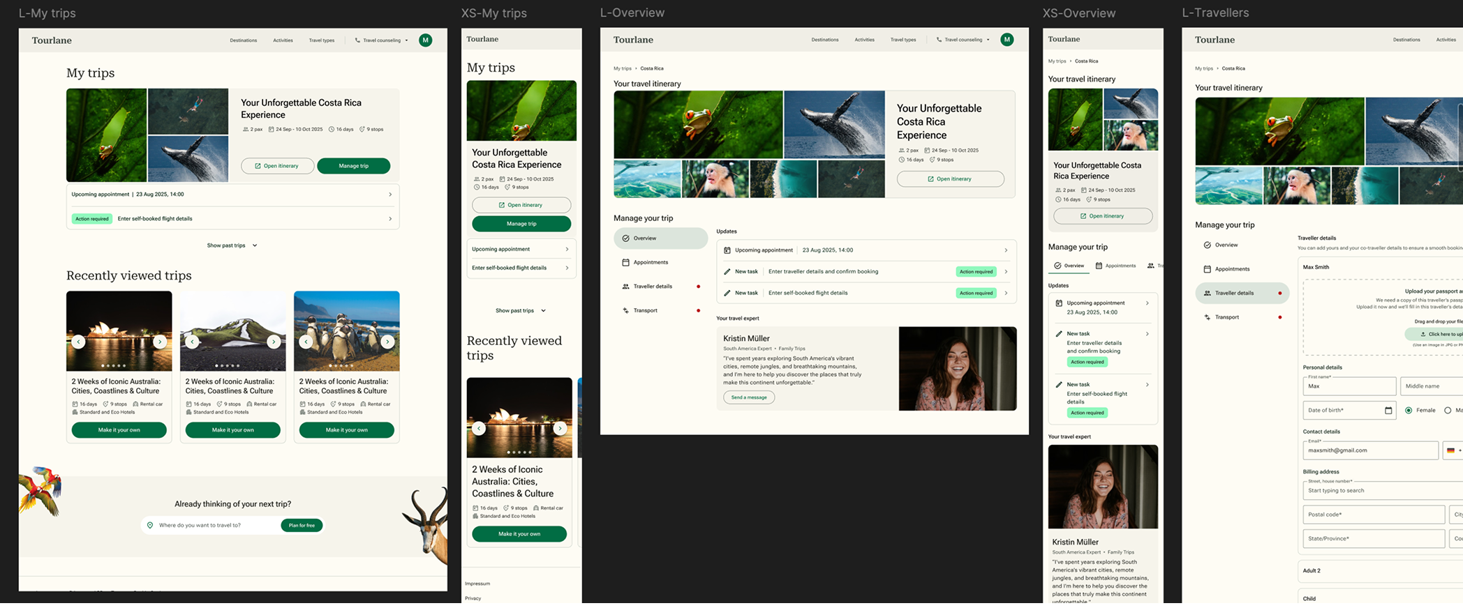
With wireframes validated across teams, I moved into high-fidelity design and a working prototype.
A rich, scalable and more intuitive navigation system.
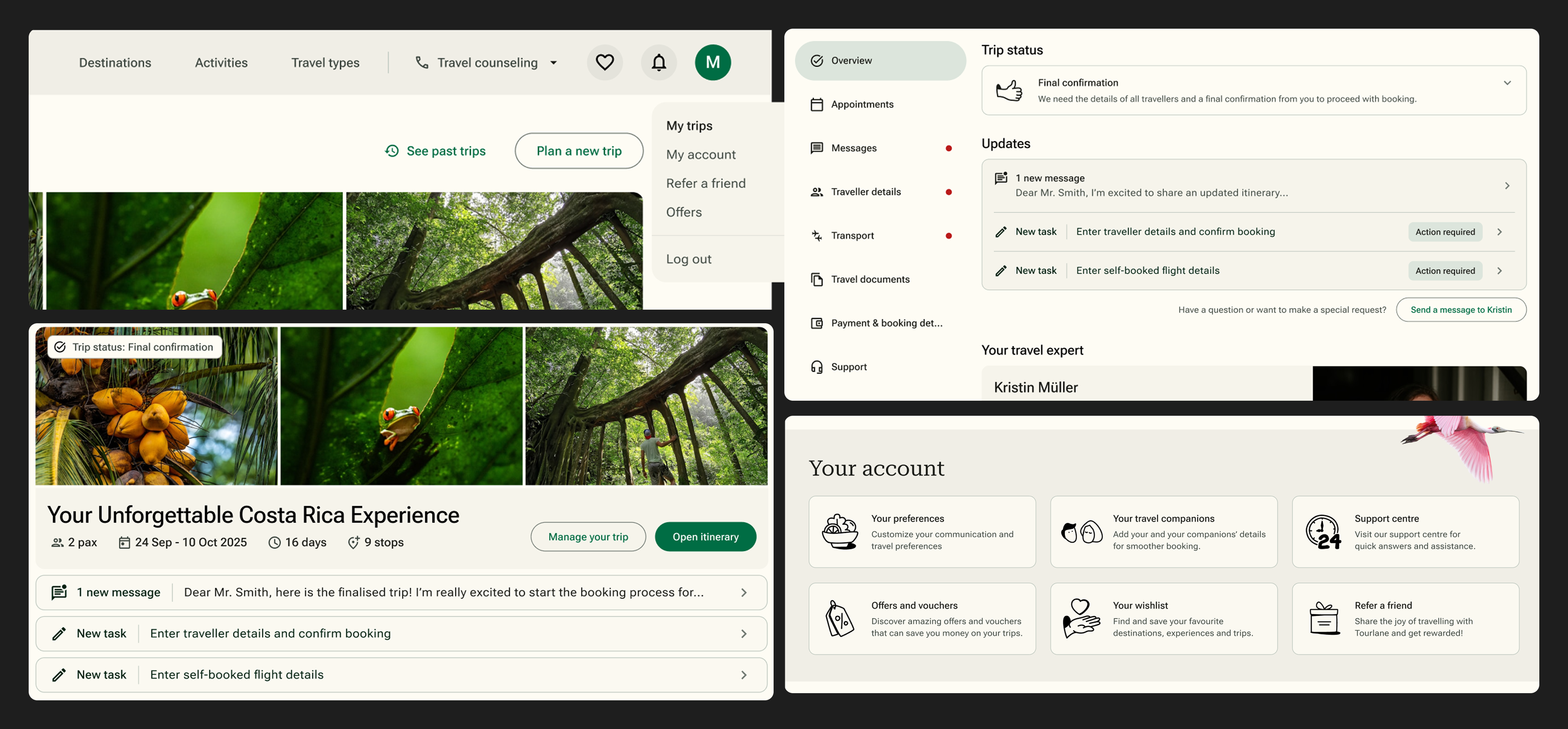
Designing to improve accessibility, transparency and trust.
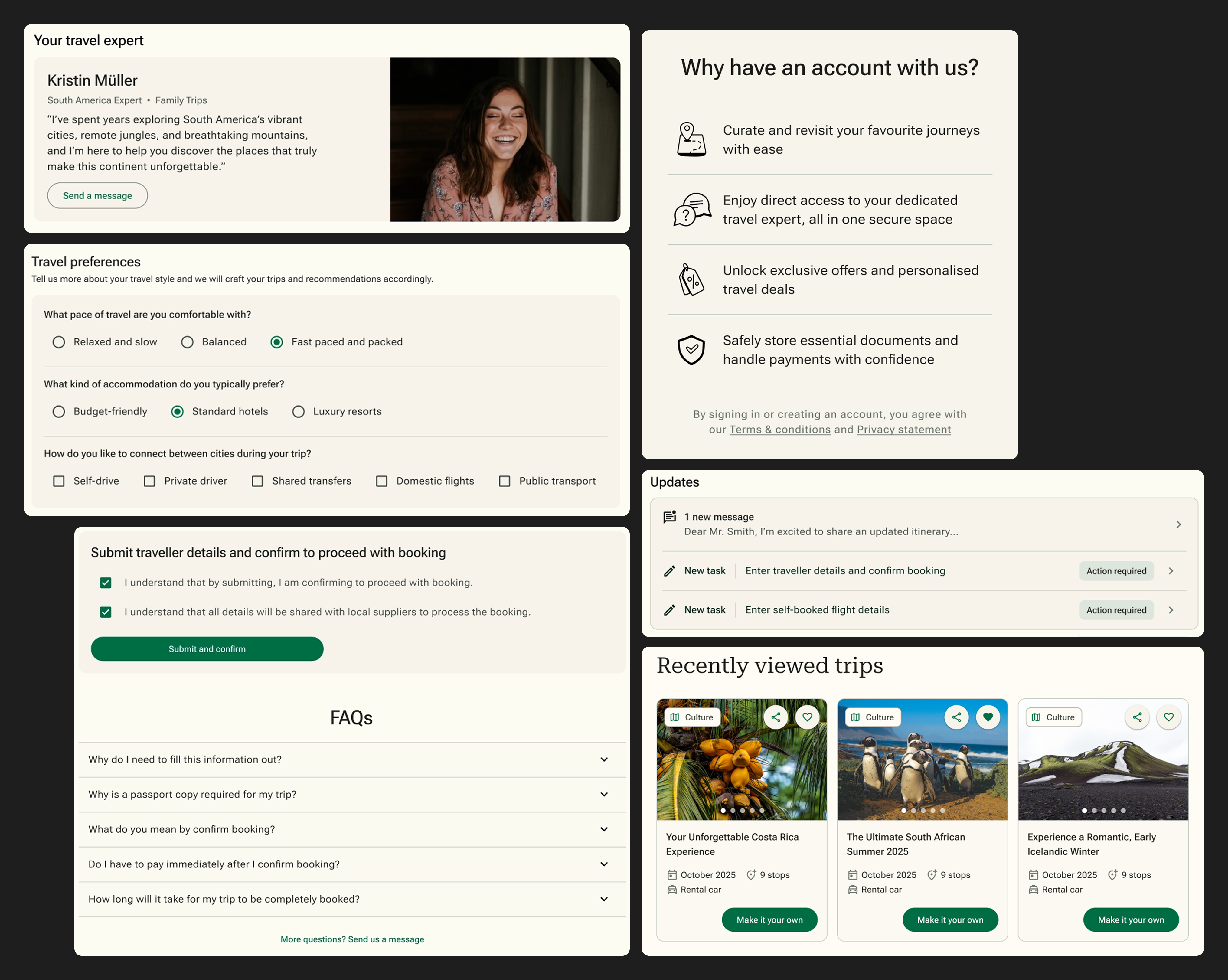
Balancing user needs with business impact.
A unified, consistent and connected hub experience.
Stakeholder response
I presented the prototype to leadership, sales, CRM, and product teams, and was met with genuine enthusiasm.
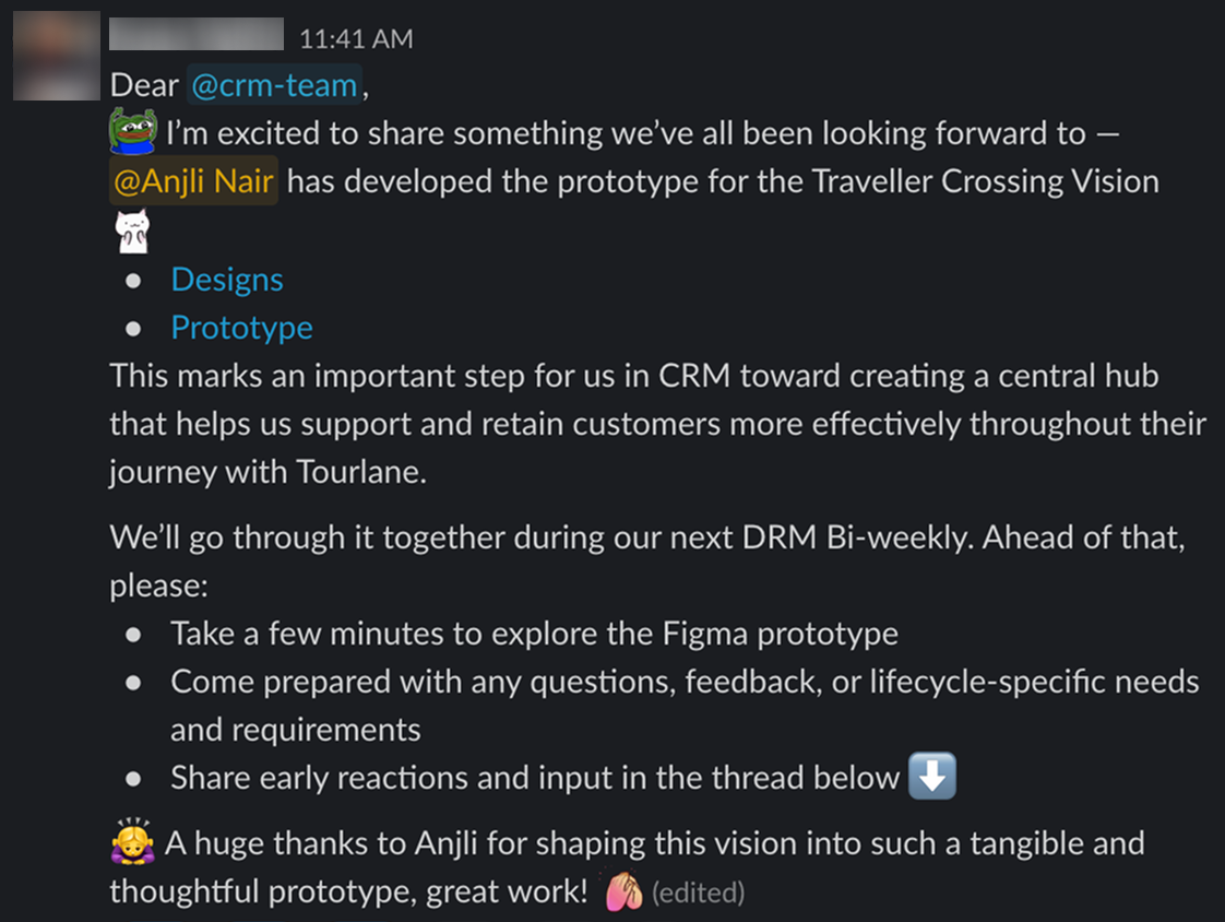
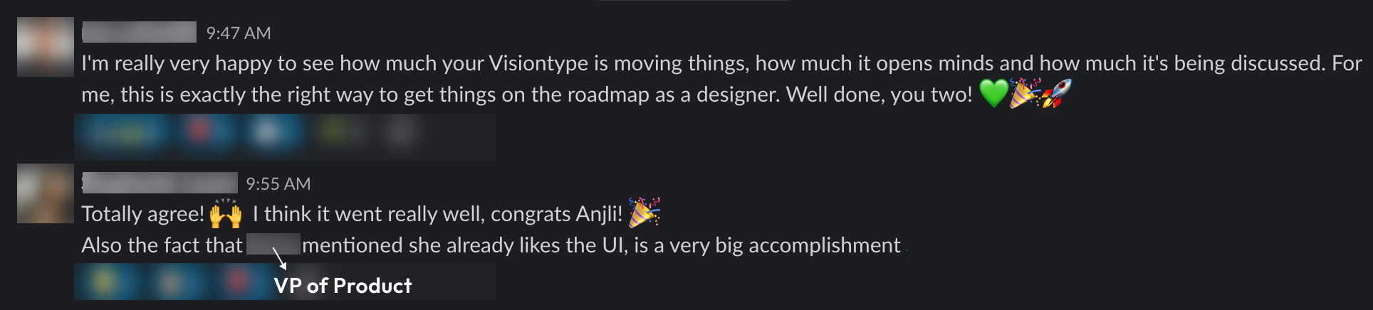
The prototype took what were just floating ideas and made them concrete and tangible. This helped stakeholders visualise and be excited about the growth of our product and business. The conversation soon shifted to "how do we bring this to life?".
05
MVP
We put together a proposal for building User Portal 2.0 from scratch rather than renovating the existing one. A rebuild meant a clean foundation that could actually support the vision, scale without rework, and fix real user and agent pain points without legacy limitations getting in the way.
Process
MVP scope: The MVP was deliberately restrained. The focus was on rebranding the portal to match the rest of the product, meaningfully improving the UX of what already existed, and establishing the right foundations for everything that would follow.
Tech workshop: I joined a workshop facilitated by the VP of Technology, bringing together tech leads and engineering managers from all customer-facing product teams.
My role was to guide the group through the current user journey, and the vision and north star information architecture, as they examined the existing technical infrastructure.
The conclusion they reached was that a rebuild would also be an opportunity to fix the tech foundation properly, rather than continue building on unstable ground.
Designs and user testing
The MVP designs focused on brand consistency and UX foundations established through the vision work and was deliberately restrained, with no new features.
Since the vision did not go through user validation, I prototyped the MVP and tested it with users through unmoderated Maze sessions.
Test results
38 users tested the MVP across 5 tasks.
Goal: Validate that the new navigation, information structure and UI patterns were intuitive before anything went into development.
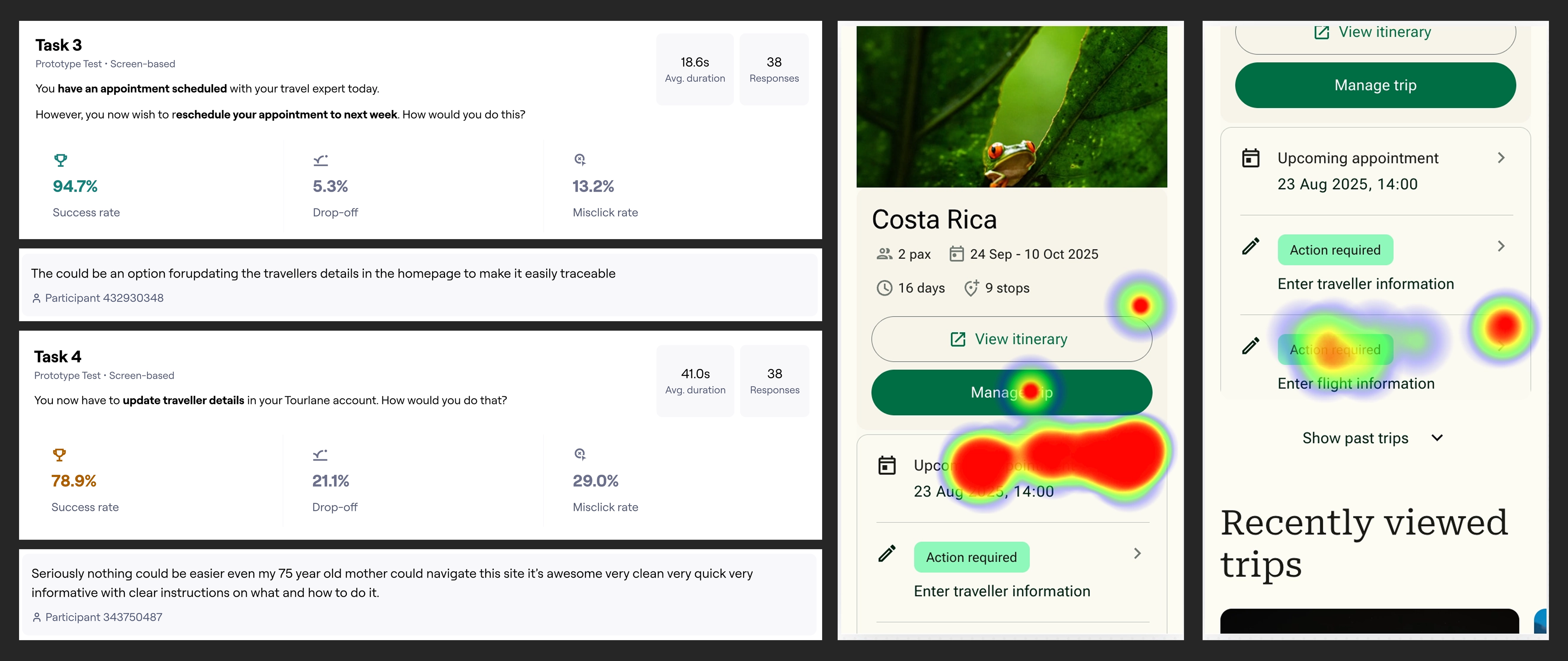
Since the vision did not go through user validation, I prototyped the MVP and tested it with users through unmoderated Maze sessions. The aim was to validate that the new navigation, information structure and UI patterns were intuitive before anything went into development.
Navigation and core flows performed strongly: task success rates of 92% and 95% for finding trip information and rescheduling appointments.
Two tasks revealed unclear wording around flight details and traveller information, pointing to specific copy improvements for the next iteration.
06
Reflections
The project was ongoing at the time of my departure, with the MVP in development. But the outcomes up to that point were significant:
- The vision created alignment so that leadership, sales, CRM, and product teams all had a shared picture of where the portal was going for the first time.
- The decision to rebuild from scratch was made and approved, a significant organisational commitment given the portal's history of deprioritisation.
- The MVP was scoped, approved, and in active design, with a clear roadmap and the right technical foundations being put in place.
The portal went from a perpetually deprioritised problem to an active project with cross-functional buy-in, which was the direct result of making the vision concrete enough that the business could see what it was investing in.